 Charts
Charts are used extensively in statistics and other fields. With chart, data become clearer, we can get a better overview, trend or relation between components in data. In presentation, charts can create stronger impression than tables. After we have already a table, charts can be drawn easily. Software like MS Excel can help us a lot in creating high quality charts.
Most frequently used charts are column chart, bar chart, scatter chart. In statistics, histograms are popular too.
Column chart & Bar chart
Column charts and bar charts are very frequently used in data comparison. For example, Table 1 show us the turnover of packaging industry.
| Region | Turnover (billion USD) |
|---|---|
| Europe | 127 |
| North America | 118 |
| Asia | 114 |
| Latin America | 30 |
| Others | 35 |
| Total | 424 |
Column chart consists of vertical rectangles (columns) in equal width. The heights of the columns represent values. Fig.1 is the column chart of Table 1.
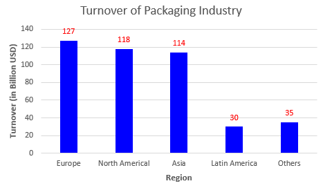
Fig. 1 Turnover of packaging industry in regions of the world
In bar chart, values are presented as widths of horizontal rectangles (bars). These rectangles have same height. Fig. 2 is the bar chart of Table 1.
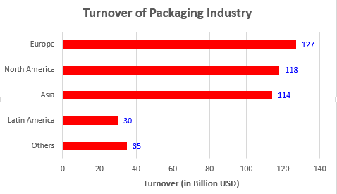
Fig. 2 Turnover of packaging industry in regions of the world
Line chart
A line chart consist of series of data points connected by straight lines. It is used frequently to show the trend or variation of a variable over time. For example, the sales of a company in 6 months is shown in Table 2 and Fig. 3.
| Month | Sales (in Million VND) |
|---|---|
| Jan. | 652 |
| Feb. | 763 |
| Mar. | 247 |
| Apr. | 273 |
| May | 359 |
| Jun. | 482 |
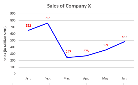
Fig. 3 Sales of company X in 6 months
Scatter chart
Scatter charts are used to show the relationship between two numerical variables `x` and `y`. They are plots of paired `(x,y)` data. A scatter plot consists of a horizontal `x` axis and a vertical `y` axis. The data are paired in such a way that they combine each value of variable `x` with a corresponding value of variable `y`, and this combination is represented by a point in chart. We can add a line (straight or curved) to represent the general relation of `x` and `y`. For example, Table 3 and Fig. 4 show the result of an experiment that study the effect of amount of preservative used on shelf life of a meat product.
| Amount of preservative used (g/kg of product) |
Shelf life (days) |
|---|---|
| 0 | 11 |
| 1 | 32 |
| 2 | 56 |
| 3 | 67 |
| 4 | 82 |
| 5 | 94 |
| 6 | 103 |
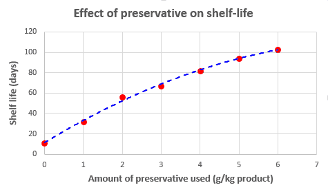
Fig. 4 Effect of amount of preservative used on shelf life of meat product
Pie chart
A pie chart consists of a circle with several slices. The area of each slice represents a part of the whole. For example, Fig. 5 is the pie chart represent the turnover of packaging industry of the regions in the world (data from Table 1).
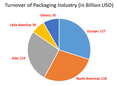
Fig. 5 Turnover of packaging industry of the regions in the world
In statistical view, pie chart is not a good method to compare value, it's difficult to distinguish values whose differences are small. So they are uncommon in scientific literature. On the contrary, pie charts appear frequently in media thanks to their beauty and eye-catching characteristic.
Histogram
We can consider histogram as a column/bar chart of frequency ; each column/bar represents frequency of a value or a group of values. The speciality of histogram is that there are not gaps between columns/bars.
Example 4 : To determine the quality of coffee bean, we take samples of 200 g then count the number of defected beans in each sample. For company C, the result with 32 samples are given in Table 4.
| Number of defected bean in sample | Frequency |
|---|---|
| 4 | 2 |
| 5 | 5 |
| 6 | 11 |
| 7 | 9 |
| 8 | 4 |
| 9 | 1 |
| Total | 32 |
From Table 4, we can construct the histogram in Fig. 6
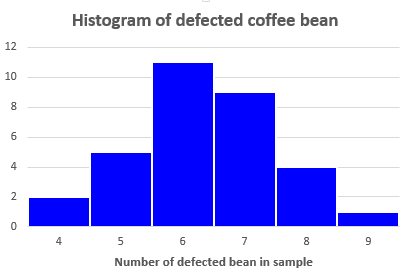
Fig. 6 Histogram of defected coffee bean of company C
Notes
- Relative frequency is often used in histogram.
- Line charts are also used to represent the frequency. This type of chart is referred as frequency polygon.
For example, from data of Table 4, we can construct the frequency polygon in Fig. 7 in which relative frequency is used.
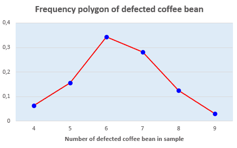
Fig. 7 Frequency polygon of defected coffee beans of company C
This web page was last updated on 01 December 2018.